-

Frame: Crystal Red and Crystal Blue
Lens: +Red Iridium and Blue Iridium
By far my favorite generation of M Frames. They are the best looking, had the coolest icon, and have some great colorways. They also look like kids toy sunglasses when compared to modern M Frames, they are a lot smaller/skinnier.
-
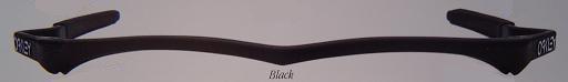
Frame: Fingerprint
Lens: Black Iridium
These are still pretty cool IMO, even for a 20 year old frame. The 80's retro style is coming back in vogue too, so they are kinda cool to wear out every now and then for fun. Of course they are very functional as well with the unbeatable coverage and light weight of an M frame. I've experimented with puting a hybrid lens on these as well (I bought them as bare frames) and found the curve of the lens not as fitting to the style as the strike. The strike also seemed to fit my face better in this particular frame. The only complaints I have is that the temples are a bit tight on me. That's probably due to the fact that they are so short which is the other half of that complaint. I now understand completely why they changed from the hammer stems to hammer fangs. Overall a cool retro piece of Oakley history and nice for display as well as the occasional use.
-
Frame: Algae
Lens: Gold Iridium
Aptly named, Algae - a translucent dark green - compliments Gold Iridium almost too well. Adding rootbeer unobtainium and matching the frame with gold icons completes this pair as a classic. The Strike lens, however, somewhat negates the prestige. With an almost over-simplified design (rectangular shape/squared-off edges), the Strike closely resembles its predecessor, the Razor Blade lens.
-
Frame: Crystal Clear
Lens: Blue Iridium
I bought these at a very young age in order to wear them during Little League games and practices. At the time, I thought they looked cool and performed wonderfully, but now I would never wear them - even if I still played Little League. I also must say that the eye coverage was excellent and so was the craftsmanship. Now I realize some people still like this style, but I feel they just look too 80's in my opinion. I do however also understand the place this frame has in history as well as the significance of it in Oakley's history, which is why I still give it a rather high rating, however I didn't give it the full 5 skulls due to my not liking the style anymore.
-
Frame: Gold X
Lens: Gold Iridium
The only difference between the new M frames & these are the frames themselves. The original aren't built as durably as the new one but they fit much closer to your head so I think they fit better with helmets & hats.


 Glasses
 Goggles
 Watches
 Alphabetical
 Video Reviews


