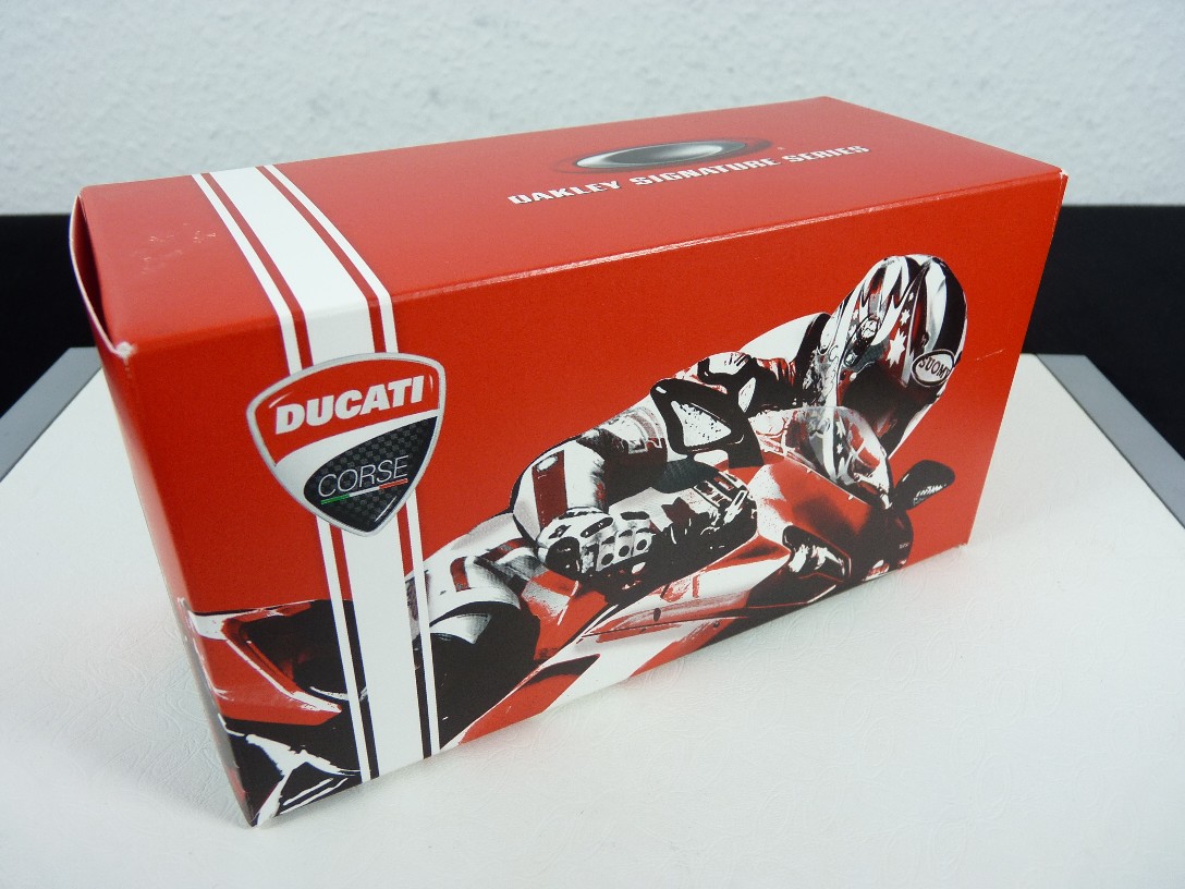
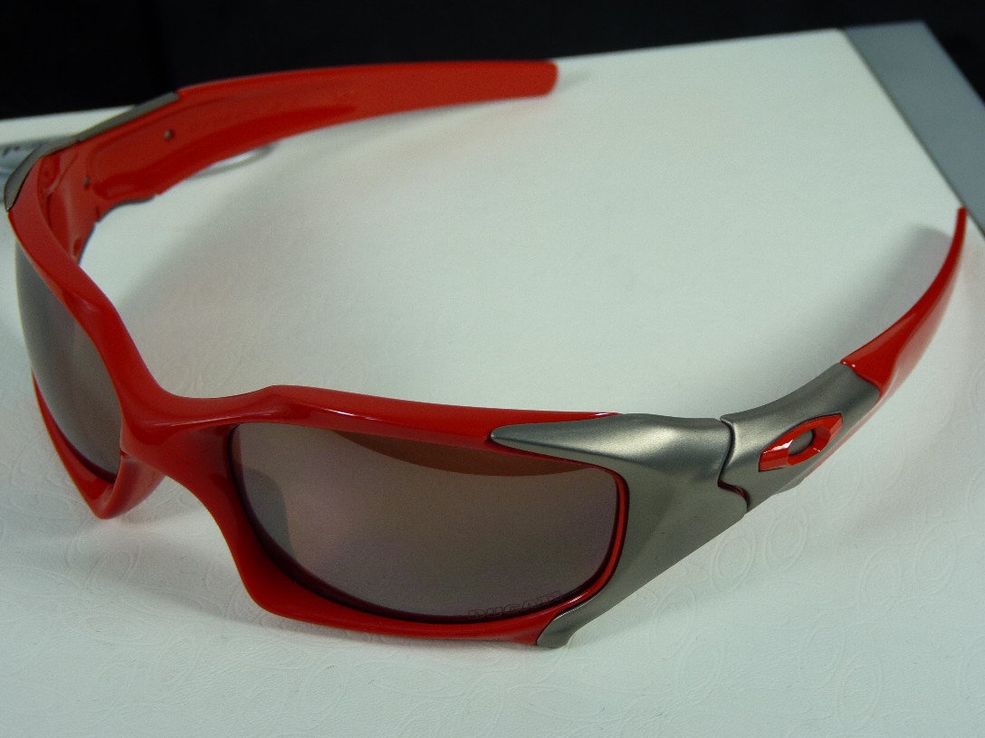
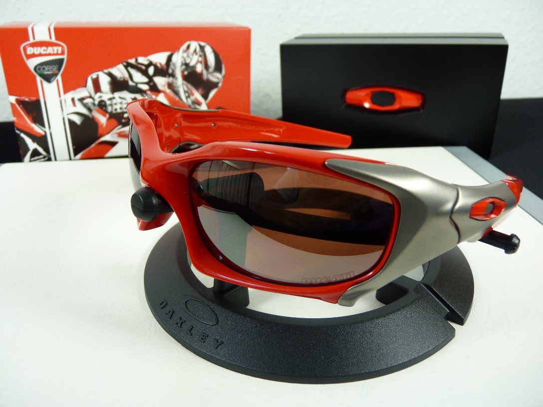
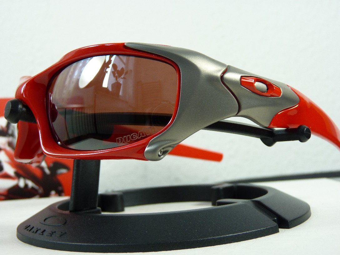
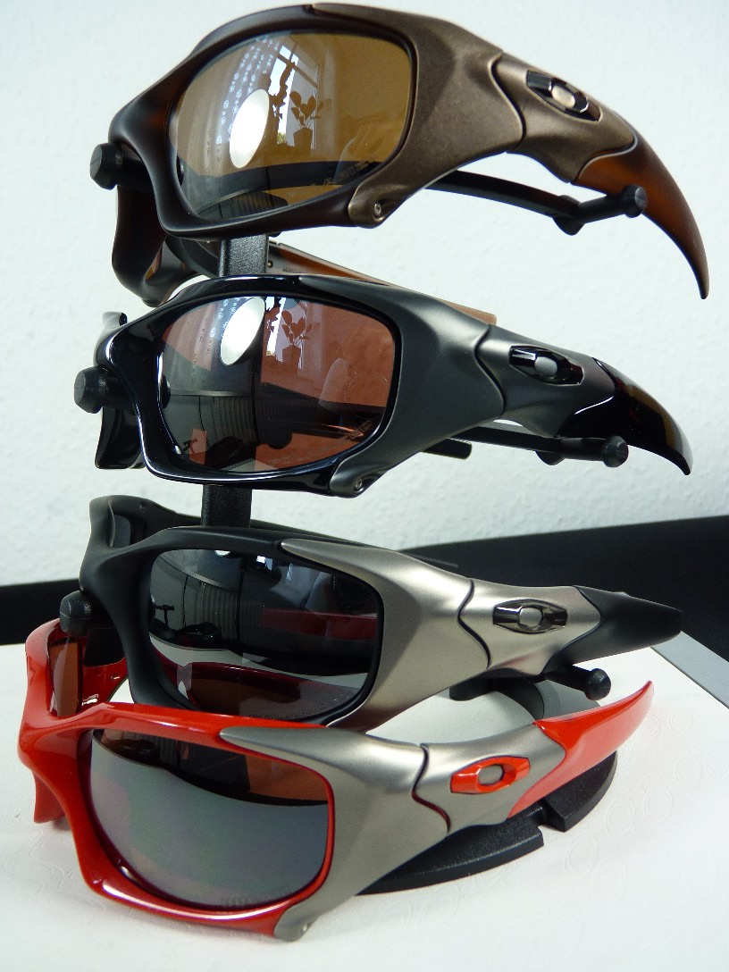
Pit Boss DUCATI w/polished red = a matter of taste ...
attention!
this is not my latest purchase! ... this is a sample from a local o-dealer ...
so i post this pictures to show the colorway ... hope this helps the undecided ...
also hope a lively discussion about frame, lenses etc. ... =)
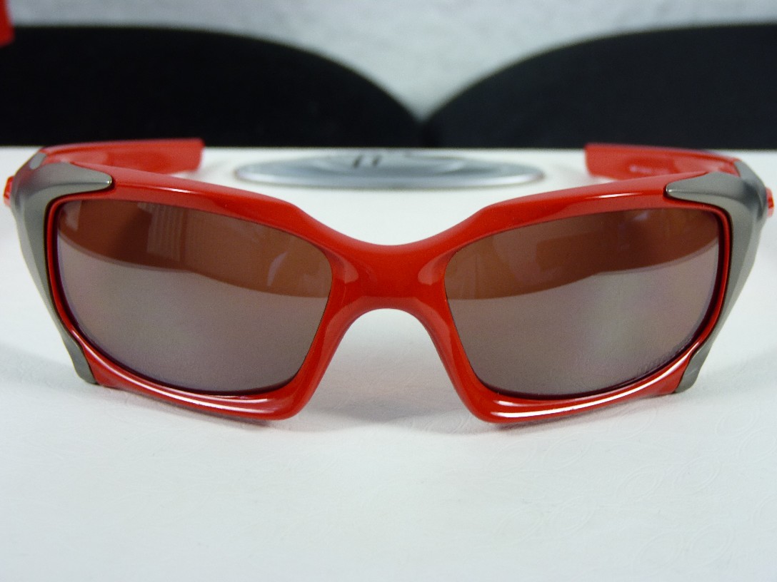
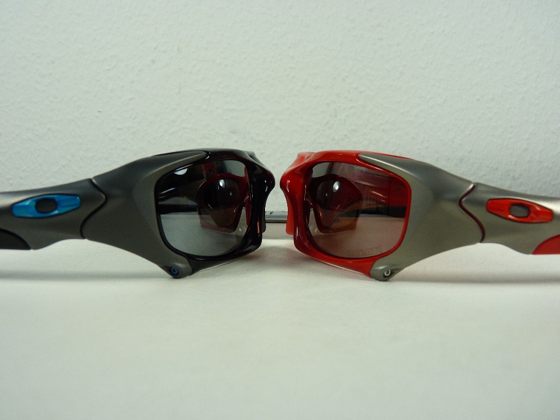
Nice pics. Typically a touch of colour enhances Oakley eyewear, but not in this case. Don't get me wrong, I also think the Ducati PB looks very nice but I think some of the muted darker colours work better for the design; the matte black and Tron are better looking, IMO. Or maybe there's just too much red for the eyes to take in. Go figure...always thought adding more colour makes everything better. Also, perhaps had the titanium on the Ducati been matte black rather than greyish in tone, it'd have been a better combination.
That said, I'll probably pick one up one day. Like I said above, it still is an attractive piece for the collection.
I hear ya Oak. It is a lot of red but I'm digging it.
The PB is almost a contradiction in some sense. It's pretty OTT with the design but being Elite they keep the color-ways still somewhat understated. Almost to balance or counterbalance the OTT design by using blacks/grays and browns. Which keeps them from being possibly a little outrageous. Part of me says a design that awesome does deserves some crazy color-ways but at the same time I think that's what cool about Elite products...they're some of the best the O has to offer but they still keep them somewhat understated and perhaps minimal when it comes to color.
So the Ducati PB is a color-way I would think an awesome design like that deserves but at the same time it seems to make it a little less Elite in a sense.
Either way...It's definitely on my short list. Gotta have one.
no problem paul ... as i said = i didn't bought it ... it's only a sample to show the colorway ...
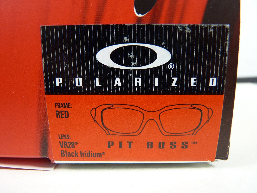
the red looks a little darker as on the pictures ... haptics is same like all pit boss ...
i would buy it for less then half price ... but only to complete my pit boss tower =)
I'd have to see them in person, but Jamey's right, they scream gas station to me. They are what you'd expect to see on a cart on the streets of Bangkok or Bali.
I think the thread topic says it all...it's a matter of taste. Maybe I don't have good taste. Ha. So be it...Ducati PB come to me.
This is the kind of unbridled enthusiasm that has been missing for a while here. You go GET that Ducati PB!!!!
Personally, I think it looks OK. I actually think the plates match fairly well with the red frame color and icons. For the money, it's just not quite my thang.
Before this thread I thought the Ducati PB was about a 3. Now I think it's about a 6.5. Cool enough, but still way out of my price range.
Thanks for the great pics/comparisons though Tag! I think it shed a lot of light on a pair that was largely dismissed as a giant red POS.
Also, I think if Oakley took some real pics of their gear, they might sell more. The cartoonish floating pairs aren't doing it for me and now they're even getting in the way of a decent pair getting a fair shake.
im not really liking it personally, as others have said it looks quite plasticy compared to the other colourways....i think the red would look ok if it was deeper in colour, like a blood red.


 Glasses
 Goggles
 Watches
 Alphabetical
 Video Reviews