by Lee Silver & Phil Barket - April 10, 2006
This article is available as a PDF with an enhanced format.
Zero.pdf - 2 Mb
Sub Zero
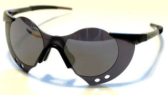
In 1992 Oakley introduced the Sub Zero, or as Oakley refered to them, “a limited selection of next to nothing.” Even to this day they are considered to be one of the most innovative designs Oakley ever produced. So radical from anything else, they featured a one piece dual orbital frameless design that incorporated Oakleys patented High Definition Optics and Plutonite lens material.
As the name implies, this was the start of Oakleys new trademark “zero weight” philosophy for increased performance, and a launch pad for a line of glasses that saw three distinct eras over the past 14 years. Weighing in at 0.69 ounces, one could easily forget you were wearing them, or even if you had them sitting perched on top of your head! And the pure plutonite lens could still stop a 12 gauge shotgun blast from 15 yards, as well as block all harmful UV and blue light.

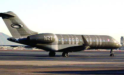
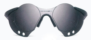
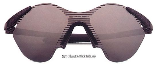
The original line consisted of the 7 original Sub Zero Frames numbered #1 through to #6, and also, the specially named N2T. These letters signified the name of another corporation owned by Oakley founder Jim Jannard, Which was famously later used in 2002 as a registration number on one of the two Oakley Bombardier BD-700 jets. (The first letter "N" signifying the international prefix for United States, and the "2T" portion utilizing the characters needed in creating aircraft registration numbers.)
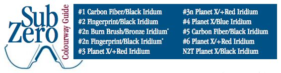
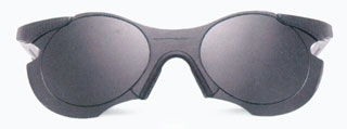
Of these 7 styles, each Sub Zero had it’s own number for identification denoting color and lens combinations, and not for size or shape variations, as in the later Zero family. Most of these new styles utilized a new and very appropriate frame color, Planet X. Though a few frames still featured the ever popular M-Frame colors, Carbon Fiber and Fingerprint.
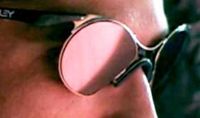
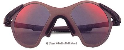
Before the end of their short life in 1993, Frames #2 and #3 were replaced with frames 2N and 3N which lost their lower orbital to give them rounder lenses, reminiscent of the wire frame Sub Zero only seen in Oakleys first aired television commercial. The N styling was first produced with the military in mind, so they were not available for retail at the time of original release, but eventually found release in 3 colorways: 2N in both Burn Brush/Bronze & Fingerprint/Black and 3N Planet X/+Red.
It’s amazing to think the Sub Zeros only lasted a short time, but the legacy they left behind was massive.
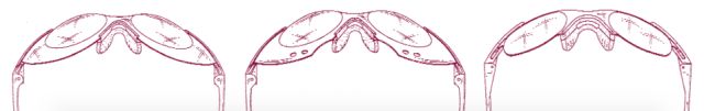
 * N styles not pictured above.
Final Sub Zero styles did not feature a Hammer stem as the sketches show but featured a straight earstem.
Zero
In late 1993 as the era of the Sub Zero began to draw to a close, Oakley introduced it’s follow up line, and the next step in radical eyewear design, the Zero. "The most from the least." The Zeros continued with the “zero weight” marketing that the Sub Zeros began, claiming these to be as light as, if not lighter than the Sub Zero line they were replacing. "The economy of form following function: Maximum eye protection with minimum weight."
When the Zero family were released, the Sub Zero identification number system was phased out and replaced with a new decimalized system generally identifying size and shape, as opposed to color combos. What remained, were a few of the same color combos from the Sub Zeros, and added were some new funky color combos, like the wildly named frame color Glitter Gulch, after a famous Las Vegas strip club, as well as Sleet and Brush.
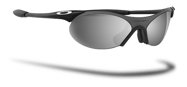
New revised earstems improved upon Oakleys three point fit system with the introduction of the aptly named Fang, an extended version of the Sub Zeros straight earstem that continued just beyond the earsock, and was designed to add even more flex than the Sub Zero did for comfort and fit. The Fang was also incorporated into later M-Frame generations, and became standard on most Oakley releases after this.
Continuing with Oakleys one piece dual orbital frameless design, each new lens types own decimal number did initially work in the way the old Sub Zero numbering system worked as each style had one colorway, only this time the lenses generally grew outward as the number size increased, creating some very memorable stylings.
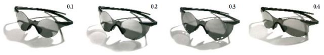
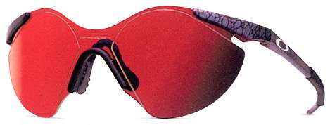
When someone talks about the Zero line, one style they will almost always think of is the flamboyant Zero 0.3. With its circular lenses, and huge opaque vented "shield" underneath each lens, which guarded against averted light and debris from entering the eyes. This was opposed to a possible predecessor of the Mars in the Zero 0.1, which was just a skeleton of what the 0.2 and 0.3 were.
Within the first 4 releases of the Zero line, the most subdued style compared to the 0.1 through to the 0.3 was the new elliptical lensed styling of the 0.4. A lens that compared to (and may have helped usher in) Oakleys first wire release, and the ever popular Eye Jacket. This was also the first of the new Zero styles to feature multiple color options outside of Brush or Sleet with Black Iridium including the aforementioned Glitter Gulch.
Not to forget were the line found it’s origins, in the second year run of the line, the 0.5 and 0.6 styles were added. The 0.5 seemed to be an often over looked style, and sprung forth from a merger of the 0.2 and the 0.4. Just as the 0.2 and 0.3 were extensions of the 0.1, the 0.5 became and extension of the 0.4 adding the shielding to the popular 0.4 style for added peripheral protection.
Zero
The 0.6 was surprisingly similar to the original Sub Zero lens shape, although they were slightly widened, and had a more rounded edge. This particular Zero now came in a wider range of lens colours, Black, Gold, and +Red Iridium, even including Clear and Persimmon tints. A few of these options even reintroduced the Sub Zero staple frame color, Planet X.
By 1996 the Zero range had evolved, now featuring
roughly a 30% larger lens on the 0.1 through to the 0.4, and modified the opaque lense shields on the 0.2 and 0.3. Also re-designing the original black corrugated box they came in, to a bigger,cleaner looking design
In addition to these changes, two new lens options were made available, the 0.2p and the 0.3p . The obvious difference being the opaque lens shields were now Iridium coated for increased peripheral visibility while still shielding the eyes from debris. These two new options brought the beginning of the first retail laser etching featured on the lower edge of left lenses. Reading "POINT 2P" and "POINT 3P"respectively, this helped the style stand out even more from their predecessors, and these models are now valued as the pinnacle of desirability from the whole range of the Zero line for todays collectors.
One more variation of note that sprang up in the Zero range was the inclusion an N2T version of the Zero 0.6, complete with Planet X extended Fang stems. What makes this release so special was that it utilized the original Sub Zero Lens from years past. This may well have been more an effort to use up surplus lenses that never made release during the Sub Zeros reign, but was a very welcome addition for those who sought out the original Sub Zero amongst this new line.
And not to leave any stone unturned, and to further play off the 0.4, we eventually saw the release of two new 0.4 styles by 1996. The 0.4 squared and 0.4 squared small. Keeping the look of the 0.4, the lens was now boxed and shrunk to create these new styles, and also brought along with it a new color option on all of the three 0.4 squared models, which was Cobalt/+Red.
As time had passed, the Zero as we originally knew it began to fade away with most of the line being discontinued, and the remnants morphing into Oakley's now more organic and fluid styling of the late 90s, with new versions of the 0.4s and an addition of a more triangular lensed model, the 0.7. Just as the style of the Zero itself had changed over the course of 6 years, so had Oakley's image, and there utterly recognizable logo from the 80s as it followed through to a new industrial, streamlined look into the future. One could say these styles opened the door to move in a new direction for the company, but that, and the ever evolving logo is a story for another time.


 Glasses
 Goggles
 Watches
 Alphabetical
 Video Reviews